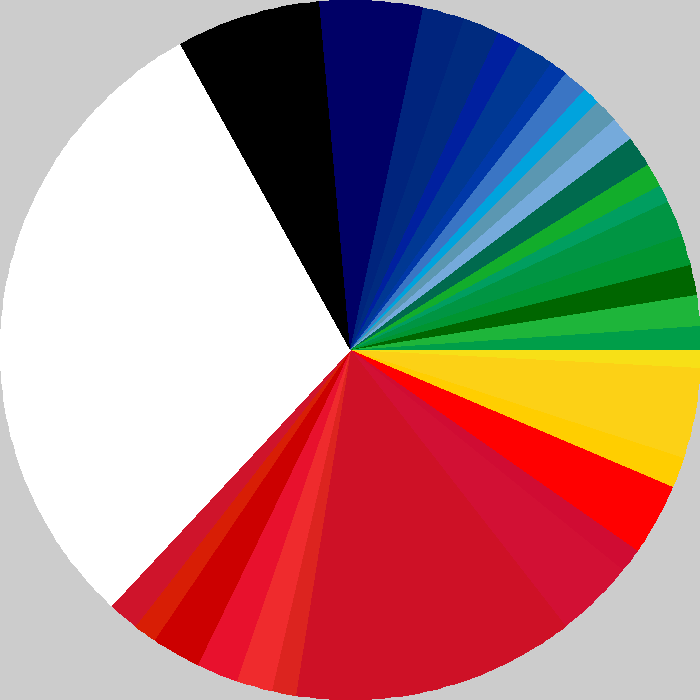
Think you know your national flags? Designer Shahee Ilyas has reproduced all the flags of the world in pie chart form. Each sector of each pie chart is proportional to the area of the color on the respective flag. For example, here’s the US flag:
By clicking on each image, you can learn which flag is represented. It’s a very cool way to look at the flags — and rather tricky to figure out which is which.
Interestingly, can you guess which color is used the most in the world’s flags? That color is far and away the winner.